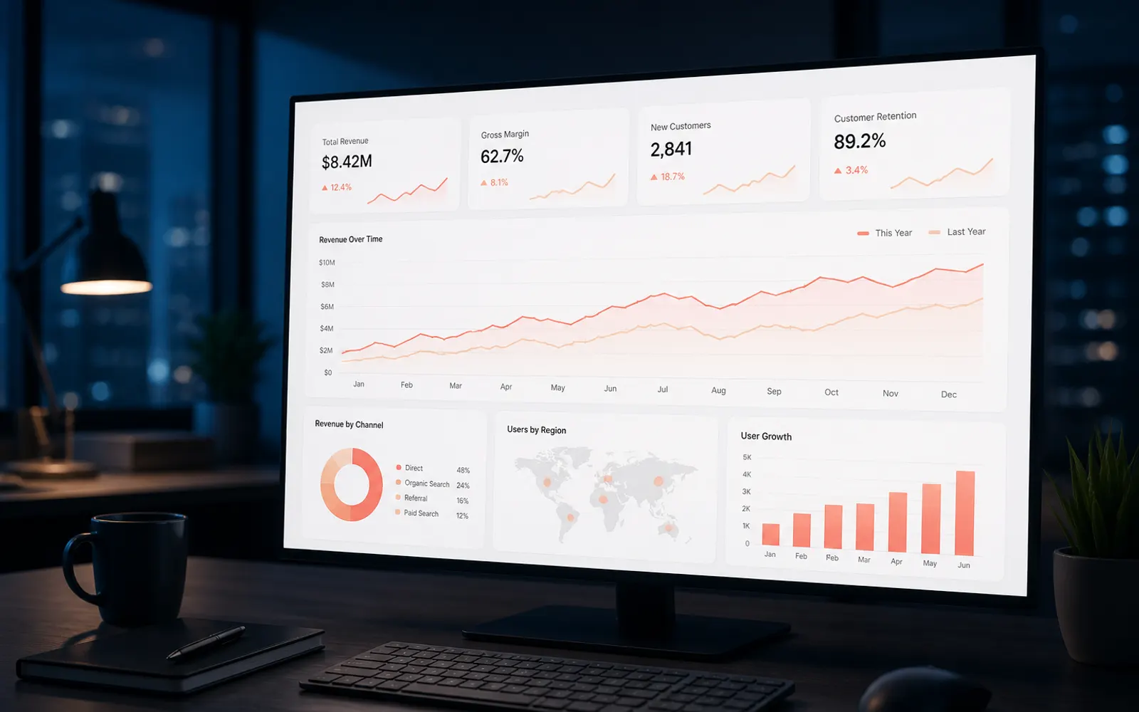
Start with decisions, not charts
A dashboard's job is not to display data — it is to support decisions. Before choosing chart types, ask: who uses this, what decisions do they make, and how often?
When you design from decisions backward, you naturally prioritize the few metrics that matter and demote the rest.
- Executive overview vs operator workflow are different products
- Daily monitoring needs different density than monthly strategy reviews
- Every widget should answer a question or trigger an action
Build visual hierarchy that scans in seconds
Users should understand the health of the system in under five seconds. Put summary KPIs first, trends second, and detailed tables last.
- Use size, weight, and position to signal importance
- Group related metrics; avoid a flat grid of equal cards
- Highlight anomalies with status color — carefully and consistently
Design progressive disclosure for power users
Experts need depth without forcing novices through noise. Use filters, expandable rows, and detail drawers so complexity is opt-in.
Default views should be calm. Advanced views should be powerful.
Make empty and loading states intentional
Dashboards often look broken when data is delayed or incomplete. Skeleton loaders, clear timestamps, and empty-state guidance preserve trust while systems catch up.
Key takeaways
- Design dashboards around decisions and roles.
- Optimize for five-second scanning first.
- Hide complexity behind progressive disclosure.
Need help applying this?
Let's turn these ideas into a clear UI/UX plan for your product.
Book a Consultation